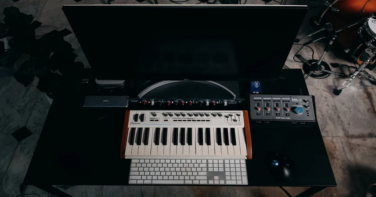
You've spent months perfecting your compressor algorithm. The transient response is pristine, the release curves are musical, and CPU usage is minimal. But when you hand it to a producer friend, they fumble through the interface, can't find the attack control, and give up after two minutes. All that engineering excellence becomes worthless when users can't intuitively access it. This isn't a hypothetical scenario—it happens constantly in the audio software world, and it's entirely preventable with thoughtful UI/UX design.
The Creative Flow State
Music production operates on inspiration and momentum. Psychologist Mihaly Csikszentmihalyi described "flow" as a mental state of complete absorption in an activity, characterized by energized focus, full involvement, and enjoyment. Musicians and producers know this state intimately—those magical sessions where ideas come faster than hands can move, where hours pass like minutes, and where the music seems to create itself.
Flow is fragile. Csikszentmihalyi identified clear goals, immediate feedback, and a balance between challenge and skill as prerequisites for entering flow. UI friction—hunting for a buried parameter, deciphering cryptic abbreviations, wrestling with awkward mouse interactions—shatters all three. The goal becomes unclear ("where is that control?"), feedback is delayed (waiting for menus to open), and the challenge shifts from creative to mechanical.
Research in human-computer interaction confirms what producers intuitively know: interface interruptions have disproportionate costs. A study by Gloria Mark at UC Irvine found that it takes an average of 23 minutes to return to a task after an interruption. While creative flow may not follow exactly the same recovery pattern, the principle holds: breaking concentration is expensive, and every unnecessary interaction is a potential flow-breaker.
Cognitive Load Theory
Cognitive load theory, developed by John Sweller in the 1980s, distinguishes between intrinsic load (inherent complexity of the task), extraneous load (complexity added by poor design), and germane load (productive mental effort toward learning). Good UI design minimizes extraneous load, leaving more mental capacity for the creative work itself.
Audio production already has high intrinsic cognitive load. Balancing frequencies across a mix, making tonal decisions, managing dynamics, maintaining a vision for the final product—these tasks demand significant mental resources. When interface design adds extraneous load through confusing layouts, unclear labeling, or inconsistent interactions, it competes directly with the creative process for limited cognitive bandwidth.
The best interfaces disappear. They become extensions of thought, translating intention into action without conscious effort. The producer thinks "more attack" and their hand is already moving to the right control. This invisible quality—the absence of friction—is the hallmark of excellent tool design.
Visual Feedback and Audio Perception
Audio is invisible by nature. We can hear the effect of our changes, but we can't see them directly. This creates a fundamental challenge: how do you design visual interfaces for an auditory medium? The answer lies in making the inaudible visible—translating sonic characteristics into visual representations that inform and confirm user actions.
Meters: More Than Volume Indicators
Level meters are the most obvious example, but even these simple displays encode sophisticated information. A VU meter's ballistic response (300ms integration time, specific attack and release characteristics) was designed to correlate with perceived loudness. Peak meters show instantaneous maxima that might clip digital systems. True peak meters detect inter-sample peaks that standard peak meters miss. Each type serves different purposes, and choosing the wrong meter for the context misleads users.
VU Meters: Averaging response (~300ms integration), correlates with perceived loudness, can miss fast transients. Best for: overall level monitoring, gain staging.
PPM (Peak Programme Meters): Faster response (~10ms integration), catches transients better than VU. Best for: broadcast, ensuring peaks don't exceed limits.
True Peak Meters: Detects inter-sample peaks through oversampling. Best for: final output metering, streaming/broadcast delivery.
K-System Meters: Bob Katz's metering system with calibrated monitoring levels. Best for: consistent mixing levels across projects.
Gain reduction meters show compression activity in real-time. A needle (or bar) dancing with the music confirms that compression is happening and shows how aggressive it is. Without this feedback, users would have to rely entirely on their ears—possible, but slower and less certain, especially for beginners learning what compression sounds like.
Spectrum Analyzers and Visualization
Spectrum analyzers reveal frequency content that ears can detect but can't precisely quantify. Is that muddiness at 200Hz or 300Hz? A visual display answers immediately. Is the high end rolling off naturally or cutting abruptly? The analyzer shows the shape. These visualizations accelerate learning by showing cause-and-effect relationships clearly—move this EQ band, see this change in the spectrum.
Waveform displays illustrate dynamic changes over time. A before/after comparison of waveforms shows compression's effect more clearly than any numerical gain reduction figure. Stereo correlation meters reveal phase relationships that ears sense as "width" or "focus" but struggle to diagnose precisely.
The Dangers of Visualization
Visual feedback has a dark side: it can override auditory judgment. Research has shown that producers make different decisions when they can see a spectrum analyzer versus when they rely on ears alone. Sometimes the visual information helps; sometimes it leads to over-processing "problems" that aren't actually audible.
Good UI design uses visualization to inform, not dictate. Meters and analyzers should be reference tools, not the primary interface. Place them where they can be consulted without dominating attention. Consider offering hide options for users who prefer to work primarily by ear.
Consistency and Conventions
Audio software has established conventions over decades of hardware and software evolution. These conventions create shared expectations that reduce learning time and prevent errors. Violating them without good reason creates cognitive friction and potential frustration.
Universal Audio Conventions
Directional conventions: Faders move vertically for level control—up means louder. Knobs turn clockwise for increase, counterclockwise for decrease. Pan moves left-to-right spatially. These mappings are so ingrained that violating them feels physically wrong, like a light switch that's "on" when down.
Color conventions: Red indicates clipping, danger, or "stop." Green indicates safe operation or "go." Yellow/orange indicates caution or approaching limits. Blue often represents cool, clean, or surgical processing. Warm colors suggest saturation, analog character, or musical coloration.
Control conventions: Large central knobs typically control the primary parameter. Bypass buttons use consistent styling across the industry. Preset browsers expect dropdown or drawer interfaces. These conventions exist because they work—they've survived decades of refinement.
Internal Consistency
Even more important than following industry conventions is maintaining internal consistency within your own plugin. If your EQ band controls go Frequency-Gain-Q from left to right in one place, maintain that order everywhere. If hovering reveals tooltips in one section, users expect tooltips throughout. If right-click opens a context menu in one area, it should do so everywhere.
Inconsistency forces users to relearn your interface in every context. Each exception to your own patterns adds cognitive load: "Wait, is it different here?" Users shouldn't have to think about how to operate your interface—they should think about their music.
When to Break Convention
Conventions aren't sacred. Sometimes breaking them is justified:
When convention causes harm: If a convention leads to user errors or confusion in your specific context, changing it may be the right choice.
When innovation provides clear benefit: New interaction paradigms sometimes improve on established patterns, but the improvement must be significant enough to justify relearning.
When targeting expert users: Power users may appreciate novel approaches that would confuse beginners, if the novelty serves efficiency or capability.
When you do break convention, break it clearly and consistently. A half-measure—sometimes following convention, sometimes not—is worse than either consistent approach.
Information Hierarchy and Density
Screen real estate is precious. A plugin window competes with the DAW, other plugins, arrangement views, and possibly multiple monitors of content. Every pixel must justify its existence. This doesn't mean minimalism at all costs—it means thoughtful information density that serves the workflow.
Primary, Secondary, and Tertiary Controls
Not all controls are equally important. Primary controls—those users adjust constantly—deserve prominent placement and generous sizing. For a compressor, this typically means threshold and ratio prominently displayed, perhaps with large knobs or responsive graphs.
Secondary controls are important but adjusted less frequently. Attack, release, knee, makeup gain—essential for fine-tuning but not the first thing users reach for. These can be smaller or positioned in less prominent areas.
Tertiary controls are rarely touched: sidechain filter settings, detector mode switches, oversampling options. These belong in expandable panels, right-click menus, or gear icon settings. They should be accessible but not cluttering the primary workspace.
This hierarchy guides attention to what matters most in typical workflows while keeping advanced options available for users who need them.
Progressive Disclosure
Progressive disclosure shows information only when relevant. A collapsed panel expands when users need those controls. A hover state reveals additional information. An "advanced" button opens expert options. This pattern keeps the interface clean by default while providing depth for those who seek it.
Effective progressive disclosure requires understanding your users. What do beginners need to see immediately? What do experts want quick access to? Where do intermediate users naturally look for additional options? User research—watching actual people use your software—reveals these patterns far better than assumptions.
Fitts's Law and Target Sizing
Fitts's Law, a fundamental principle of human-computer interaction, states that the time to reach a target depends on the distance to the target and its size. Mathematically: T = a + b × log₂(D/W + 1), where D is distance and W is target width.
For UI design, this means: frequently-used controls should be large and close to where the cursor naturally rests. Small targets are acceptable for rarely-used controls, but forcing users to precisely click tiny buttons for common actions creates frustration.
The corners and edges of windows are special cases—they're infinitely large targets because the cursor can't overshoot them. Placing important controls (like close or maximize buttons) at edges exploits this property.
Accessibility Considerations
Professional audio users span a wide range of abilities. Designing for accessibility isn't charity—it's good design that benefits everyone while enabling users with disabilities to work professionally.
Color Vision Deficiency
Color blindness affects roughly 8% of men and 0.5% of women of Northern European descent, with different rates in other populations. The most common form, red-green color blindness (deuteranomaly and protanomaly), makes it difficult to distinguish red from green—exactly the colors most software uses for "danger" versus "safe."
Design solutions include:
Redundant coding: Don't rely on color alone. Combine color with shape, position, or text. A clipping indicator can be red AND flash AND show "CLIP" text.
High contrast: Ensure sufficient contrast between adjacent colors regardless of hue. Tools like the WebAIM Contrast Checker help verify this.
Colorblind-friendly palettes: Blue-orange contrasts work for most colorblind users. Avoid problematic combinations like red-green, green-brown, blue-purple, and green-gray.
Testing tools: macOS and Windows include colorblind simulation modes. Use them to verify your design works for affected users.
Motor Control and Target Size
Users with motor control issues—tremors, reduced precision, repetitive strain injuries—struggle with small click targets. This population is larger than you might expect, especially among aging professionals who've spent decades using mouse and keyboard intensively.
Minimum touch targets of 44x44 pixels (Apple's guideline) provide reasonable accessibility. For desktop software, slightly smaller targets may be acceptable, but anything below 24x24 pixels becomes problematic for users with reduced motor control.
Keyboard navigation is essential for users who can't use a mouse effectively. Ensure all controls are reachable via Tab and adjustable via arrow keys or direct input. This also serves power users who prefer keyboard efficiency.
Screen Reader Compatibility
Visually impaired users rely on screen readers to navigate interfaces through spoken feedback. Proper labeling of controls—using accessibility APIs provided by your GUI framework—enables this navigation.
JUCE provides accessibility support through its AccessibilityHandler class. Ensure all interactive elements have appropriate labels and roles. Test with actual screen readers (VoiceOver on macOS, NVDA on Windows) rather than assuming your labels are sufficient.
The Business Case for Good UX
Beyond creative benefits, good UX directly impacts business outcomes. Interface quality affects conversion, retention, support costs, and word-of-mouth marketing.
Trial Conversion
Most commercial plugins offer trial periods. Users download, install, open the plugin, and make a purchase decision based on their initial experience. If someone can't achieve useful results in the first five minutes, they move to a competitor—regardless of how good your DSP is underneath.
First impressions stick. Research in psychology (the "halo effect") shows that initial positive impressions bias subsequent judgments positively, and initial negative impressions bias judgments negatively. A confusing first experience colors everything that follows.
Support and Documentation Costs
Confusing interfaces generate support tickets. Users ask questions that well-designed interfaces answer automatically. They report "bugs" that are actually usability issues. They request features that exist but are too hard to find.
Each support interaction costs money—staff time to respond, systems to manage tickets, documentation to maintain. Reducing confusion through better design reduces these costs directly while improving user satisfaction.
Word-of-Mouth and Reviews
Users who successfully integrate your plugin into their workflow become advocates. They recommend it to colleagues, post positive reviews, create tutorial content, and answer questions in forums. This organic marketing is more valuable than any advertising spend.
Users who struggle with your interface do the opposite. Negative reviews mention "confusing," "couldn't figure out," "too complicated." Forum posts ask "how do I even use this?" These signals warn potential customers away.
Designing for Different Skill Levels
Your user base includes total beginners who don't understand what compression does, intermediate users who know the concepts but lack experience, and expert users who've been working professionally for decades. Serving all three groups with a single interface requires careful design.
Beginner-Friendly Defaults
Ship with sensible defaults. A compressor should load in a state that actually compresses in a useful way—not with threshold at maximum where nothing happens. An EQ should start flat, not with random boosts and cuts.
Consider preset categories that guide beginners: "Gentle compression," "Aggressive limiting," "Vocal presence boost." These serve as starting points that beginners can adjust rather than building from zero.
Expert Efficiency
Power users want speed. Keyboard shortcuts for common actions, right-click menus for quick access, double-click to reset parameters to default, precise numerical entry for exact values. These features don't interfere with beginners—they simply exist for those who seek them.
Consider parameter linking, macro controls, or custom configurations that experts can set up for their specific workflows. The initial setup time pays off in long-term efficiency.
Educational Affordances
Help intermediate users grow. Tooltips that explain what parameters do and suggest typical values. Visual feedback that shows cause and effect clearly. Well-written manuals that cover not just how but why.
Some plugins include built-in tutorials or interactive guides. While potentially annoying for experienced users, these can dramatically accelerate learning for newcomers—especially if they can be dismissed permanently.
Testing and Iteration
Good UI design isn't achieved through genius—it's achieved through iteration. Test your designs with real users, observe their behavior, identify problems, and refine your solutions.
User Testing Methods
Usability testing: Watch users attempt specific tasks with your interface. Where do they hesitate? What do they misunderstand? What do they not notice at all? Even five users reveal most major usability issues.
A/B testing: For established products, test interface variations with subsets of your user base. Which version leads to more successful task completion? More engagement? Fewer support tickets?
Heuristic evaluation: Have UX experts evaluate your interface against established usability principles. This catches issues before user testing, saving time and resources.
Analytics: Track how users actually interact with your software. Which features are used? Which are ignored? Where do users spend their time? Data reveals patterns that assumptions miss.
Iterative Refinement
Plan for multiple iterations. Your first design won't be perfect—no first design ever is. Budget time and resources for refinement based on testing feedback. The most successful interfaces in the industry went through countless revisions.
However, avoid endless iteration without shipping. At some point, refinement hits diminishing returns. Ship a good design, gather real-world feedback from a larger user base, and iterate based on actual usage patterns.
Conclusion
UI/UX design is not an afterthought or a luxury—it's fundamental to whether your audio software succeeds or fails. The best DSP in the world is worthless if users can't access it effectively. The most innovative features mean nothing if they're hidden in confusing menus.
Design for flow. Minimize extraneous cognitive load. Respect conventions while innovating where it matters. Create visual feedback that informs without dominating. Consider users of all abilities and skill levels. Test with real people and iterate based on evidence.
The goal is tools that disappear—interfaces so intuitive that users forget they're using software and simply make music. That invisibility is the highest achievement in audio UI design, and it requires as much care and expertise as the audio algorithms underneath.